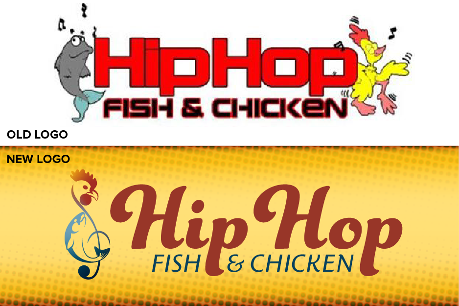
The Old Logo vs. The New Logo

The New Logo on White Background

New Logo Mark
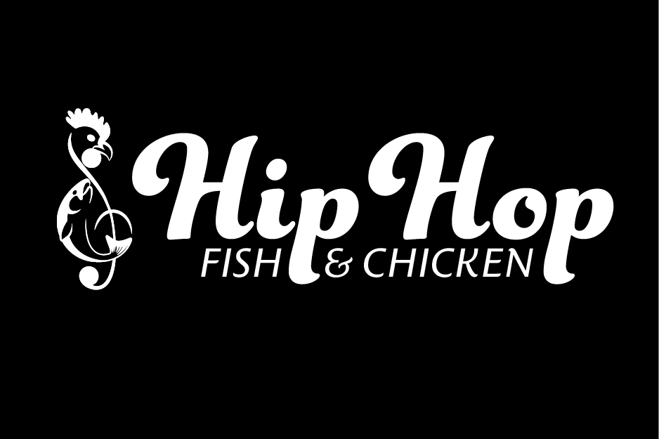
New Logo on Black
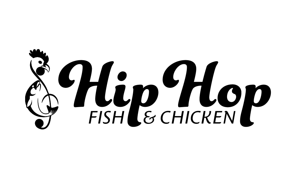
New Logo in Black & White

Concept of Takeout Box Wrap for chicken orders

Concept of Takeout Box Wrap for fish orders
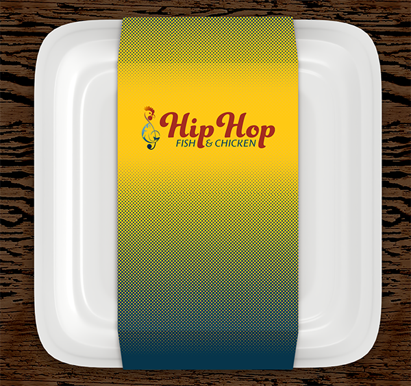
Concept of Takeout Box Wrap for fish & chicken combination orders
The chicken and fish box is a staple of Baltimore, MD soul food, and none is more ubiquitous in the metro area than the local chain, Hip Hop Fish & Chicken. With over 30 locations across the Baltimore/D.C. metro area, they are one of the go-to fast food locations for catering large family functions and to on-the-go workers who need a fulfilling meal to do their best.
The food is delicious and mouth-watering, but the branding needed to evolve with the company in the same way that the food has evolved in the region. I wanted to take this local favorite and give it a new lease on life that will earn them the customers and revenue that they deserve when they expand outside of the Baltimore/D.C. metro area.
The new branding had to encompass the funky, musical spirit of the original while streamlining and updating the imagery. I incorporated the fish and chicken into the treble clef icon to give it a brand mark that is distinct and memorable. The typefaces and colors showcase that this is a family-friendly establishment. It reflects food traditions going back a century and Sunday dinners at Grandma's, but is also a hip location to enjoy fast food fried chicken and fish. Lastly, I chose to use a halftone pattern as a supporting graphic element to emphasize the funky, scrappy nature of the chain's city of origins, Baltimore, MD.
Have you ever taken a group lunch order for work, only to spend 30 minutes figuring out which boxes contain what food and who they belong to? The takeout boxes make use of the halftone pattern and brand colors to differentiate which kind of orders are in the boxes. The yellow/red, blue/dark blue, and yellow/blue refer to chicken, fish, or combination dishes respectively. I have left space on the top of the box for notation to be made by the cashier, for either customer names or notes about the order such as side dishes to be handwritten by the order-taking associate.
*This is an unofficial rebranding, the original logo is © HipHop Fish & Chicken, Inc.